Graphic design is an ever-expanding field. It’s gaining more importance because of the role being played by the internet. If you are into it, you should be aware that certain graphic design rules should always be followed. This article will look into those rules and some other important info regarding graphic designs you need to keep in mind.

Things You Should Know About Graphic Design
Before we discuss graphic design rules, we have to discuss a few basic things about it.
First of all, let’s discuss just how big the graphic design market is. In 2021, this market is projected to be worth $45.8 billion. To say that it’s lucrative would be an understatement. The U.S. graphic design marketplace alone is already worth $12.7 billion. It’s no wonder that so many people are trying to get into it.
Why is graphic design so important? For example, when it comes to websites, 94% of users say that they will leave a website if the graphics are poor. It only takes 50 microseconds for a user to register the visual appeal of a site. Also, 46% of site users connect the website’s visual appeal to the credibility of the business that owns that site.
Graphic Design Rules
The stats that we have gone through are proof that graphic design is crucial. Now here are some graphics design rules that you must keep in mind:
Rule #1: Be Consistent
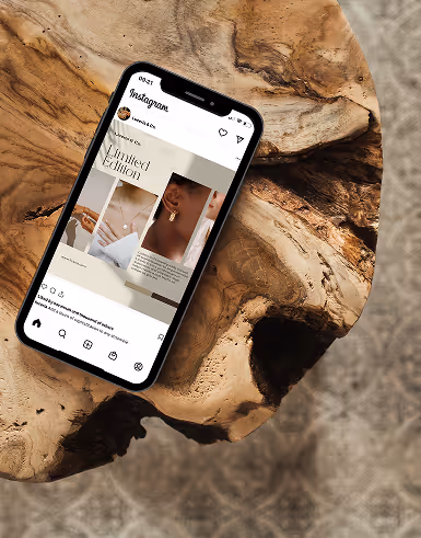
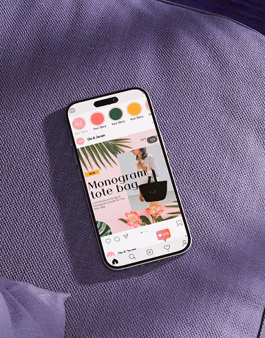
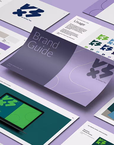
When designing for a business or a brand, it’s essential to be consistent with all the elements you will be using. For example, the fonts and the colors that will be used should stay the same on all the posts.
This is why developing a brand book is crucial. Under the brand book, you will set the colors and typography used for the project so you will always be consistent with your output.
Rule #2: Make Sure the Text Is Legible
Don’t forget about the legibility of the text when you are creating a design. It won’t matter if the design looks incredible if people cannot read the text that goes with it. This is where typography plays a vital role in graphic design. The font and the colors which you will use should go together. Some fonts may be good to look at, but they would be difficult to read.
Rule #3: Make Sure Colors Go Together
Avoid color discord in your design. That means the colors which you will be using should not go against each other. The result can be jarring as it would vie for the attention of the person looking at it.
Rule #4: Maintain Proper Scale
When you are scaling down designs like logos, make sure that you use proportional scaling. If you don’t, the design will look weird and different from the original one. It would also look less professional, which would reflect badly for your business.
Remember, bad design will draw the viewer’s attention and take away from the main message you are trying to convey.
Rule #5: Don’t Use Raster-Based Images
Do not use raster-based images because these types of images tend to appear pixelated when they are enlarged. Stick to larger images with far better resolutions that would still look sharp and crisp even after they are enlarged.
Rule #6: Keep Things Aligned
When text, images, or other design elements are not aligned properly, it can be very distracting for those looking at it. Avoid having elements misaligned at all times. Make sure that all the texts on your pages are aligned. Whether it’s horizontal or vertical, you need to maintain the alignment of the text.
You don’t have to pick some fancy alignment scheme. A simple left-alignment should be enough. Messy text can ruin the overall design and appeal of your site.
Rule #7: Use Three Fonts That Are Right for Your Niche
There is a tendency to break this rule often. Just take a look at some of the websites that are currently available. People don’t think that fonts are quite essential and so they just pick whatever is convenient. Others choose fonts without really thinking about it.
You can see sites that are a mess when it comes to fonts. Some have so many fonts that it’s the first thing that you would notice on the site.
So, when doing graphic design, stick to three fonts at the most. If you can, just use two.
Rule #8: Use Visual Hierarchy
Visual hierarchy means emphasizing an item through the use of design elements. The idea is to use those elements to draw the attention of the person looking at the design. That can be done because we know how the human brain works.
When it comes to the text elements, headings and subheadings can be used to draw the reader’s attention.
Rule #9: Watch Your Grammar and Spelling
Some might complain that checking grammar and spelling is not really the job of the designer. That’s the problem of the copywriter or whoever it is that’s tasked with writing the text for the design. But that’s a common mistake that causes some glaring errors to end up on the designs’ finished outputs.
Grammar, spelling, and punctuation mistakes will always creep in the copy no matter what, but it’s the task of everyone involved to scan it and that includes you as the graphic designer. You have to read through and make sure there are no glaring mistakes that can ruin the whole design.
Rule #10: Empty Spaces Are Okay
Some new designers are uncomfortable with leaving blank spaces on their designs. If the design calls for it, then blank spaces shouldn’t be a problem. You should learn when to leave out space as blank instead of cramming visual elements there.
These are just a few of the graphic design rules that you should be familiar with. Following these can definitely help the design outputs that you are creating. Should you wish to enlist the help of professional graphic design experts, look no further than Delesign.

Krisana is a journalist turned SEO Content Writer with keen interest in tech, software, and innovations. She is an avid fan of Elon Musk and wants to be part of the future Human Mars Mission. In the meantime, she spends her time researching and writing about everything that could make life a better place on Earth. Outside of work, Krisana dedicates her time with her two lovely kids.