Small businesses often suffer from one fatal flaw: bad web design.
Your products are great, and you’ve been in the business for a long time– so what’s the problem?
Simply put, without a good site and quality graphics, no one will know how great your company really is.
The good news is, there are some common mistakes that you can avoid to improve your site. Read ahead to learn why bad design can hurt your site, and how you can fix it.
1. Poor Graphics Do a Disservice to Good Products
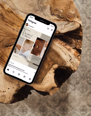
We’ve all heard the saying: a picture is worth a thousand words. If the purpose of your website is to make conversions on products or services, this couldn’t be more true.
You’ve put countless hours into creating the best products and services for your customers, but the truth is, unless you have graphics to match that level of quality, you’re in trouble.
Unfortunately, bad design only serves to make your products look lower quality than they actually are.
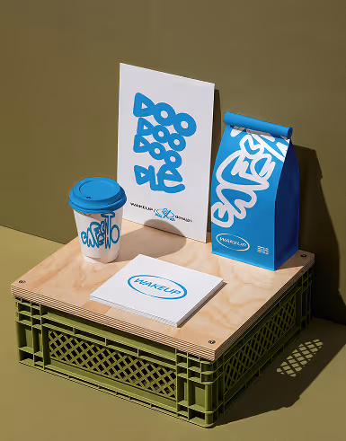
So, what’s the solution? The first step here is to create stunning images of your products.
If your business is based on services, you need to create a sleek portfolio of your work.
Here are some important basics to keep in mind:
- Use well-lit images to showcase your products
- Your images should be high-resolution and never blurry
- Include simple details to give context to your images
- Consider using videos to demonstrate your products or services
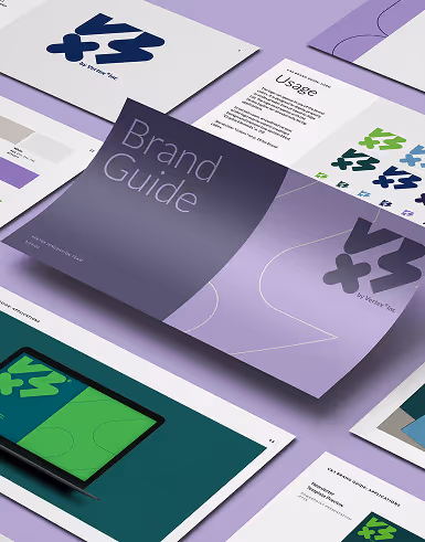
- Use compelling graphic design to capture visitor interest
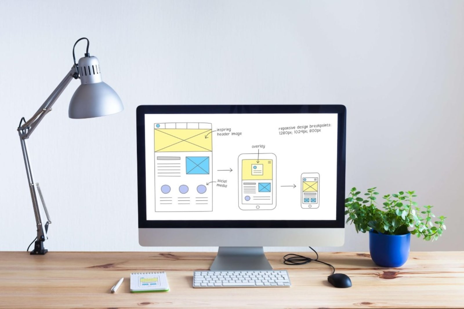
Now, it doesn’t stop at product or service images. The way you showcase these images matters.
The product page of your site should be streamlined and easy to navigate. Important details should be readily available to the visitor. Last but not least, it should be very easy to find your product page. If your customers are struggling to find what you offer, you’ve got a major problem on your hands.
2. Your Site Is Missing Important Features
If you’re using a very basic website, chances are you’re missing some key features. Why are these features so important? To put it quite simply, they boost your conversion rate.
One of the most important features often overlooked is the “call-to-action.” A call-to-action helps guide your visitors towards a specific goal. That goal could be a newsletter sign-up, member registration, or an offer for a free trial.
A call-to-action (CTA) helps turn site visitors into leads, and hopefully, customers. A proper site will incorporate a call-to-action seamlessly into the visitor experience. You don’t want to bombard the visitor with too many pop-ups.
There is a fine line between an effective CTA and an annoying one. So, what makes a good CTA? It shouldn’t surprise you that graphics come first on the list.
Clean, professional graphics make all the difference between a useful CTA and a cheesy pop-up. Remember, you’re asking the customer to trust you with their email address, so your CTA should look professional, and credible.
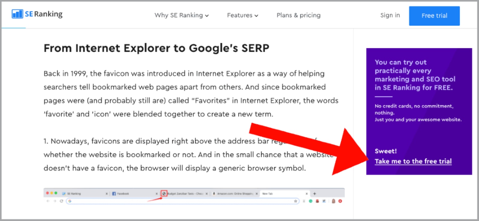
Sometimes all you need is to choose the right color that catches the users’ attention, take a look at this example from seranking.com.
Another important element of a CTA is the wording. Keep the text short and sweet. It should be very clear to the customer what it is you’re asking for, and what they receive in return. Here is a perfect example of a precise, catchy, and clear CTA from SleepJunkie.
Ultimately, if your site is missing a good CTA, you’re missing out on a lot of opportunities, so be sure to include this site element.
3. Bad Graphics Mean High Bounce Rates
Alright, if you’re new to web design and site analytics, this particular jargon might sound intimidating. Rest assured, it’s actually fairly simple to understand.
To better understand the concept of bounce rate, here’s an example: have you ever visited a site that was difficult to navigate, had hard-to-read text, or cheesy graphics?
If the answer is yes, I imagine you turned tail and ran away from that site as fast as possible.
Well, that reaction is referred to as bounce rate, and you want to keep that number as low as you can. One of the best ways to keep visitors on your site is with good graphics and great web design.
Now, creating professional-looking graphics doesn’t have to be a difficult task. In fact, there are a lot of graphic design software options out there that are free to use, and easy to learn.
Once you’ve created great graphics, make sure they’re incorporated seamlessly into your site. A compelling image is a simple way to capture the attention of your target audience and keep them on your site.
4. A Poorly Designed Site Confuses Visitors
This is a big one that a surprising number of sites struggle with. A site that is difficult to navigate can seriously hurt your success.
Think about it– if you are visiting a site and you can’t find something simple, like a contact page, the overall experience is diminished.
Or, maybe the site is just inconveniently organized. No one wants to click through several pages to reach the destination page. Every aspect of your site should be clearly presented and easy to navigate to.
Another thing to keep in mind is mobile optimization. Most of your visitors will be browsing on mobile devices at some point. You need to make sure your website’s mobile experience is just as convenient as the classic desktop site.
Mobile optimization is one of the most important things you can do for your site for one major reason: Google likes it. In fact, Google openly states that mobile-friendly sites are ranked higher. So, make sure your site is up to par.
5. Cluttered Sites Lose Leads
While some sites keep it too simple, other sites take it too far. A cluttered and slow loading website will drive visitors away and make for a frustrating visitor experience.
Yes, you should incorporate stunning visuals, helpful demonstration videos, and an effective call-to-action. That doesn’t mean you should have a CTA popping up every 3 minutes or a ton of busy graphics. Moderation is key.
The goal is to incorporate these elements in the most effective way possible. That means sticking to high-quality graphics that best represent your brand.
Stick to a couple of simple, well-designed CTA’s and call it a day.
If your site is overly crowded it’s going to seem far less professional, and less credible. Keep it clean and simple, and you’re already in a better position.
Last Advice
When in doubt, look at your site from the visitor’s perspective. Ask yourself, would this be a pleasant experience for a first-time visitor? If the answer is no, head back to the drawing board and adjust those key elements.
Make sure your site is simple and not overcrowded. Ensure that your site is mobile optimized and easy to navigate. Invest in great product images and demonstrations. Make sure you’ve got thoughtful, well-placed call-to-actions to gain valuable leads.
With these simple steps, your site will be vastly improved in no time.

Jon is a content marketing expert and founder of jontorres.com, a blog dedicated to teaching others about affiliate marketing and SEO. Jon writes about his experience in web-based entrepreneurship and digital marketing.