Email pop ups are perhaps the most controversial marketing tactics today. They tend to interrupt the user experience and confuse visitors.
But on the positive side, they can boost the number of signups on your website. Eventually, helping your business generate more conversions and sales.
Providing, of course, your pop ups are well-designed and thoroughly executed. In fact, a study reveals that pop ups can improve conversion rates by over 1000 percent!
Sounds quite cynical? Just make sure to avoid these major pop up mistakes and continuously boost the reputation of your website!
1. Asking for too much information
Putting too many fields in the pop ups is the biggest mistake that most advertisers constantly stick to. The internet is home to numerous rip-offs.
Visitors won’t risk giving out their personal details unless it’s a proven reliable site. No matter how compelling your offer or how well-designed your website, they won’t still like the idea.
To build initial trust, request for as little information as needed. That’s because visitors are likely to opt-in if there’s only less information in the form.
The fields which you have to request the readers to fill in basically depend on your business’s nature. For one-step pop ups, such as exit-intent pop ups, an email address is what you should usually ask for.
While for multi-step pop ups, you can request for further information. Here, you can include 2-4 forms of fields.
The first pop up can be a simple Yes or No question. If accepted, provide another pop up that requests additional information (e.g., name, contact number). Note that visitors did not come to your page to fill-up the form. Having fewer fields will not only save their time.
Your conversion will undergo a major boost as well. Imagine increasing up to a 160% conversion rate.
2. Having too many call-to-actions
It’s your CTA that should be put to blame for why you have trouble converting visitors. Your landing page highly appreciates a strong call to action.
It has also proven to be a powerful instrument for the success of a company. A single mistake will make you lose a great amount of lead in just a matter of seconds. Fond of inserting too many messages in your email pop up? As tempting as it may seem to add multiple calls to action, it’s generally a bad idea.
For instance, some companies ask visitors to subscribe to a blog, watch a video, and download an e-book. Hence, making it vague to spot the conversion goal.
Better stick to one so the prospects won’t be confused. If your goal is to earn more video views, then that must be the call-to-action button on your page.
Don’t forget to use action words and verbs!
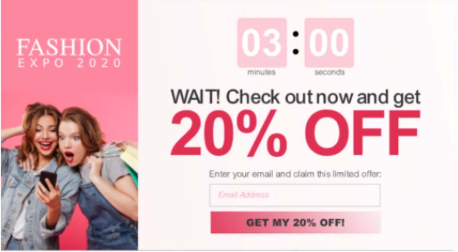
3. Using wrong pop up triggers
Getting blasted with an offer even before reading a single word from the content is definitely worse. It’s like entering a store, yet the staff already keeps on insisting on their offer.
When it comes to email pop ups, remember that timing is everything. You don’t want to distract your user’s browsing experience.
Triggering too early, and people will debar the pop up or click out of your site. Triggering too late and you’ll miss out on potential clients and valuable visitors.
What should you do instead?
Allow them to spend some time on your website before hitting them with an offer. Now, determining the right time is quite trickier.
The best pop timing is around fifty to sixty percent of the average page time. Evaluate the time people spend on your site with the use of Google Analytics.
Though there are other ways to time your email pop ups, you can also make an exit-intent pop up that instantly displays once consumers decide to leave the page.
4. Giving irrelevant offers
The online market is highly competitive. So, you want to make sure you are capturing the interest of a person the first time he lands on your page.
Avoid offering things that aren’t relevant at a given time, like offering a free e-book when a prospect leaves a shopping cart. It won’t make sense at all. Consumers possibly need an added off to the plan or a certain offer to persuade him to convert.
The rule of thumb: your offer must be exclusive, specific, and stirring to develop interest among visitors. It should be as promised.
Catchwords like sale, discount, and free are so common. They no longer impress people as much as they did a few years ago.
That’s because thousands of websites are already providing e-books and templates for free. This is where your creativity should exist.
Why not offer a special discount or a hard-to-resist giveaway? Such as an instant ten percent off coupon or freebies.
You can also offer free shipping of your product. Otherwise, an exclusive deal once they sign up for your newsletter, like showing the benefits that will gain consumers.
5. Absence of a close button
The majority of marketers undervalue the importance of pop up close buttons. They try to use unseen, small, difficult-to-click ‘X’ or, worse, completely remove the buttons altogether.
The pop up itself is already annoying for most people. Do not add the fuel by making it hard or impossible for them to close the button.
Tactics like placing the exit button in a complicated spot are not a good idea too. You are not encouraging your consumers but building distrust.
The struggle is more evident for huge sized pop up windows. Not providing them an option to exit will make them exit your page and never return.
So, what are some ways to make it easy for people to exit your pop up?
- Provide a ‘Close Window’ statement or other similar commands. It should inform what the anchor or button will do.
- Put a highly visible ‘X’ button in the pop up’s top right corner.
- Use the same strategy used by Wishpond, where the pop up closes once the visitor clicks anywhere. We can say it is the most convenient option.
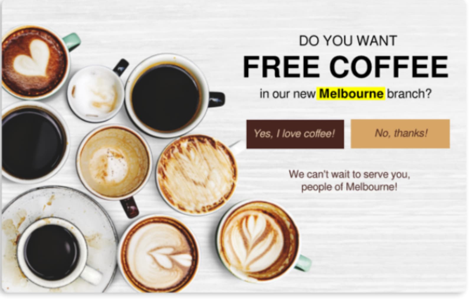
Otherwise, display a positive and negative option as a CTA button. For example, allow the users to either download the e-book (positive call-to-action) or not download it (negative call-to-action).
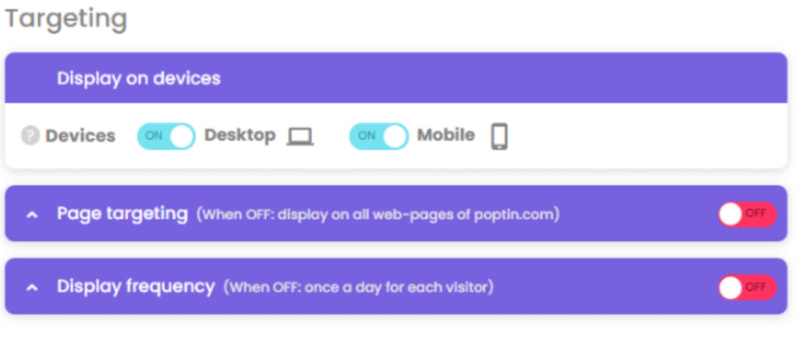
6. Not utilizing pop up targeting options
Most marketers also face an issue about the disparity between what they should offer and who they should target. Make sure your pop up and its timing are well-planned to boost engagement better.
According to a professor at McCombs School of Business at the University of Texas, Wendy Moe:
“For users who sought out fairly in-depth information from the site, the added pop up basically overloaded them with information, and as a result, they exited the website earlier than they would probably have otherwise. For those who were browsing at the site and were not seriously seeking lots of information, the pop up was a welcomed interruption to their browsing experience.”
So, avoid confusion, especially among new organic visitors. For example, don’t announce a new product feature and, instead, offer an email course relevant to your post.
There are several ways to target offers. It can be based on location, URLs, or cookies. Consider who will get your offer before setting a pop up.
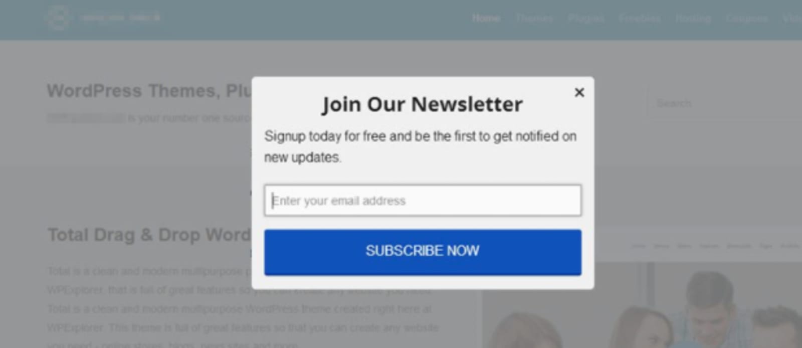
7. Being satisfied with plain pop up designs
Remember, pop ups are supposed to be attractive and eye-catching. Even though it’s a small square with trivial information, it proves to be crucial in building value and trust.
No, your website doesn’t have to look like a lavish brand. However, settling for cheap design will only reduce your conversion.
Aurora Bedford from NN/g shares that “the initial perception of the site must actually match the business.” What’s valuable to you could be another ‘meh’ for some, so striving to make a classy and luxury design is not always ideal.
A good design means steady trust among visitors and, therefore, more conversions. You can take a look at this study to give you an idea about how website design affects the trust of consumers.
To make sure you’re attracting prospects, follow these pop up practices:
- Use contrast while making your call-to-action notable to the public eyes
- Include a lot of whitespaces and relevant images
- The font should be easy to read (dark fonts are mostly preferable to light fonts)
- Include striking visual elements whenever possible
- The pop-up design must be consistent with your website or webpage
Conclusion
As you see, email pop ups don’t need to be annoying at all. It can actually catch the attention of your visitors as well as engage and encourage interaction. This is your stepping stone to increasing marketing and sales conversions. An effective pop up is what you need. Stop making these mistakes with your website pop ups as early as now. They will not only feel less disturbing for visitors but also convert the subscribers and conversions you want. Bigger conversions equate to bigger sales!

Abbey Claire Dela Cruz is the Marketing Manager of Poptin. Her expertise as a content writer and marketer revolves around devising effective business strategies to drive growth. When not working, she indulges herself with nature; creating once-in-a-lifetime adventures and connecting with people of all sorts.