
When it comes to growing a business, the one mistake most entrepreneurs make is that they think that exceptional results take many changes and a lot of money.
But in reality, that isn't necessarily the truth. Even minute design alterations – ones you can implement on your own – can help boost growth. And, perhaps even more importantly, they can ensure that the increase in business happens at a sustainable rate so that you can successfully keep up with the market demand.
So what is it that you should be focusing on when looking to get your business to the next level? Well, if you're in it for the long run, it should, without a doubt, be these two elements: customer experience and customer retention.
Why Customer Experience & Retention Matter
If you're intrigued by the potential benefits of investing in customer experience and retention, you'll first have to understand their exact impact on your business results.
On the one hand, customer experience pertains to your target audience's entire buying journey.
From the moment they're introduced to your brand to the moment they've received their purchased product, everything you do has an impact on how they will think about your brand. Obviously, the better their experience (streamlined website browsing, easy checkout process, quick delivery, good returns policy, competent customer service), the more positive their impression of your business will be.
On the other hand, customer retention refers to the rate at which your customers keep coming back.
The higher your customer retention rates, the more future-proof your business is.
Essentially, this is because customer acquisition often necessitates more funds than retaining existing buyers. In other words, the happier your existing customers are, the more likely they will be to increase their AOV (average order value) and purchase frequency. And that will bring more revenue to your budget without the high costs of reaching new people.
Now, you might find yourself wondering: what in the world does design have to do with customer experience and retention?
Well, here's the thing: the way your website looks and performs has a significant influence on how your potential buyers will think about you. Not only does design dictate first impressions, but it can also:
- hugely influence conversion rates
- drive brand authority
- manage consumer expectations
- encourage return purchases
With that in mind, it's more than worth investing in design to improve customer experience and retention. Here are the top strategies that can help you do just that.
Web Design Hacks for Boosting Customer Experience & Retention
Think Through Content Hierarchy
One of the easiest design hacks you can implement on your website is to pay attention to the content hierarchy.
As a rule, you should be aiming to display high-value elements in the most prominent positions on your pages. But the catch is not to just think of value in terms of how much you gain by having a customer click on a CTA button. More importantly, look at things from your potential customers' perspectives.
What do they want to find when arriving at your landing pages? How can you convince them that your products are the best solution to their needs? Sure, you may be thinking that matching user intent has nothing to do with design. But that's where you're mistaken.
It has everything to do with design.
Just think about it: the way you present the content on your website will inform web users whether they've found what they were after. What you put above the fold, the featured images you choose, how you organize your headings are all key signals. In other words – present your content well, and you'll have a much easier time convincing visitors to turn into clients. But get this step wrong, and they'll most likely be closing your site and going to your competition.
For a great example of a brand doing content hierarchy right, look at the Real Thread homepage. This brand follows its unique value proposition with a concise benefits section. Then, it combines the power of images and typography to call attention to all the high-value things it offers: high-quality T-shirts, great customer service, a simple design process, etc.

Source: realthread.com
It's a simple design choice, but it works. And that's because it does just what it's supposed to: it convinces potential buyers to stop looking at competitors' offers and start creating their T-shirts right away.
Enable Intuitive Navigation
Another design hack you can implement to boost customer experience is to look at your navigation menu and see whether it does a solid job of satisfying customer needs. In this matter, many customers implement customer onboarding software to provide a positive experience and also boost customer retention.
Think about it this way: every person who lands on your website requires a solution to one of their problems. And your navigation menu can help them find that solution much quicker, minimizing the chances of them becoming frustrated and leaving to shop with one of your competitors.
By ensuring that your navigation menu is both attention-grabbing and well-organized (like in the example below from Eachnight), you can get your customers to their final destination more quickly.
That way, you won't just be positioning your brand as the answer to their needs. But more importantly, you'll be ensuring that they get a positive impression and walk away satisfied with the service you've provided.

Source: eachnight.com
It's also not a bad idea to include a powerful search function on your pages, like the one used by REI. As you can see, a text search on this site brings up both tabs for products and articles, helping audiences get what they're after without having to navigate between the e-commerce and content-oriented parts of the brand's site.

Source: rei.com
Improve Microcopy
Most entrepreneurs and advertisers focus on website copy for improving performance. But while it is highly efficient at directing customer experience, it's not the only element you should be looking to improve. In other words, unless all the copy on your website does a great job, you'll be losing business.
Fortunately, there's a solution to that: improving microcopy or UX text.
These small instances of copy are most often thought of as placeholders for fields where a consumer is supposed to enter their data. But, while that is one of their functions, they can also be much more.
Good microcopy can not only strengthen branding but also drive conversions, encourage lead acquisition, and act as a trust signal. Furthermore, it can prevent consumer confusion and offer reassurance about the legitimacy of your business.
For example, the microcopy on the Mr. Porter website does an excellent job of providing customers with all the relevant information they need to have a satisfactory buying journey.
If you look at the cart section, you'll see two notifications: one regarding deliveries during sales and another for local taxes. Moreover, the items in the consumer's cart are concisely described regarding color, size, price, and quantity. And, the bottom right section of the page includes easy-to-see contact information. This addition makes it uncomplicated for buyers to get in touch regarding any possible questions, ensuring that they have a stellar customer experience (and come back to the site the next time they want to purchase this type of product).

Source: mrporter.com
Pay Attention to Accessibility
In 2021, mobile accounts for approximately 54% of all web traffic. So, knowing that the majority of your visitors are likely to be looking at your pages on small screens, you should be taking steps to ensure they get an exceptional browsing experience on all their devices.
Not only should you invest in responsive design and page load speeds, but try to take things a step further.
When designing your website, try to follow elementary rules that benefit accessibility:
- Pay attention to your typography.
- Make sure that there's enough contrast between your CTA buttons and their backgrounds.
- Break up long chunks of text.
- Include sufficient negative space around each of the elements.
For inspiration, check out Skillcrush. This brand does an excellent job at implementing accessible design on its website, resulting in an equally pleasant browsing experience on all devices, regardless of screen size.

Source: skillcrush.com
But the company's success doesn't just stem from a site that looks good on people's iPhones. It's that the design is so well-thought-out that it looks 100% professional, which, in the end, is what people are looking for when browsing online teaching platforms in the first place.
Simplify Sign-Ups and Payments
If you stop to think about the type of customer experience that drives retention, you'll quickly realize that the best websites make it extremely simple for consumers to get what they're after. So, by minimizing friction and removing any instance of risk, you can increase the likelihood of a potential customer turning into a buyer (so that you can start providing them with a great shopping experience and nurture loyalty).
One way to do this is to simplify the sign-up and payment processes on your website.
For example, you don't need to ask for a ton of information for a free trial period. A name, email address, and password should be enough for most products. As you can see from the screenshot below, Aura, a SaaS brand, does precisely this.

Source: app.goaura.com
Instead of overwhelming potential clients with tons of requests, the brand makes it easy to get started with its product. The result is a better overall website experience and an increased chance of new clients sticking around to become the brand's loyal customers.
You can also apply the same principle with payment methods. Knowing that consumers prefer digital payment methods but often find them overly complicated, a solution such as two-step payments could exponentially increase the chances of encouraging web visitors to convert into clients.
Add User-Centric Elements
If you feel like changing the UX design aspects of your websites requires too big of a commitment, why not start with something a bit less demanding? Sometimes, even a small change in content can make a big difference in how your customers perceive your brand. For example, you can do a great deal by adding user-centric elements to your homepage.
You could choose to include customer stories on your homepage, as done by Ad Badger.
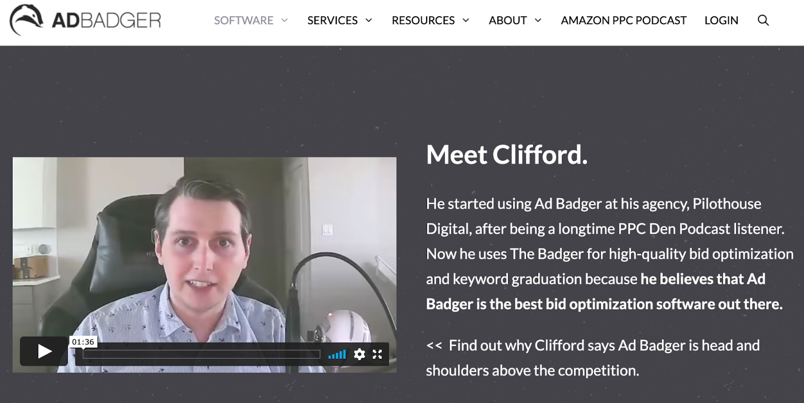
Source: adbadger.com
Or include an interactive element that immediately solves some part of your audience's needs, like this calorie calculator by MyFitnessPal.

Source: myfitnesspal.com
Fitbit does something similar with its Find Your Fit quiz. It's another excellent way to shift perspectives. Instead of describing product features, Fitbit asks questions, then offers optimal solutions.
As you can see, all of these user-centric elements do a great job at boosting customer experience, encouraging conversions, and driving loyalty. But the reason they're such a stellar strategy for startups is that each of them is easy to implement.
You might choose to embed a video on your homepage, source user-generated reviews from Trustpilot, or create a separate landing page for a quiz or calculator you came up with. Whatever you opt for, rest assured that you're bound to see some pretty impressive results. At Quiz Plugin WordPress, we specialize in creating interactive, fun, and engaging quizzes that resonate with your audience, helping to grow your brand while delivering valuable insights into customer preferences.
Call Attention to Values and Practice Transparency
Last but not least, if you're truly dedicated to giving consumers what they're after, you'll have to keep up with the increasing demand for brand transparency.
Sure, being transparent about your values and practices may seem like a complicated thing to do. But rest assured that you can get quite far with a couple of design changes.
Small adjustments, such as ensuring that your Privacy Policy and TOS pages are easily accessible, can both lead to great results. So can adding an informative FAQ section to your product pages.
If you check out the Little Emperor product pages, you'll see that the brand does precisely this.
By stating relevant info about its production process, it's not just sending the message that it cares about the environment and the people living in it. It's also enabling potential customers to know what their money is going towards.

Source: littleemperorclothing.com.au
In Closing
As you're well aware, great design plays a key role in helping your brand stand out.
But, if you're thinking about the things you can do to secure your business' growth in the long run, consider approaching design from a user-oriented POV. That way, you won't just impress at first sight.
More importantly, you'll make your website geared towards providing a stellar customer experience. Ultimately, you’ll be sending the signal that your brand is worthy of consumer trust and loyalty.
Natasha is a lady of a keyboard whose fields of expertise could be summed up in marketing, branding, and business growth-related topics. She is always happy to collaborate with awesome blogs by sharing her knowledge. To see what she is up to next, check out her twitter.com Dashboard.