Creating a website is not just having a page to dump information about your products and services. Particularly in the financial sector, website design elements can impact their clients and their image as a company.
The United States tops the list of countries with most users visiting a financial website. They have over 48.1% contribution to traffic in banking websites, 30% to investing, and 65.6% share of visits to insurance websites. While people from other countries also visit financial websites, the U.S. is more critical of reading and consuming financial content online.
Placing financial website design elements needs proper planning to make it an effective landing page for clients, to improve the bounce rate, and, as a consequence, attract more visits.
How Do You Create a Financial Website?
Financial services companies usually hire an agency, designer, or outsource to third-party providers when they need a website. Larger firms may even have their marketing team design their website for them.
When planning a design that works well for the clients and the entire organization, incorporate these financial website design elements that every financial service website needs to have.
Let us look at some of the top financial websites based on monthly visits according to Statista and examine the design elements they use on their web property. These financial institutions have monthly visits ranging in millions, making them substantial examples.
1. User Interface That’s Easy To Navigate
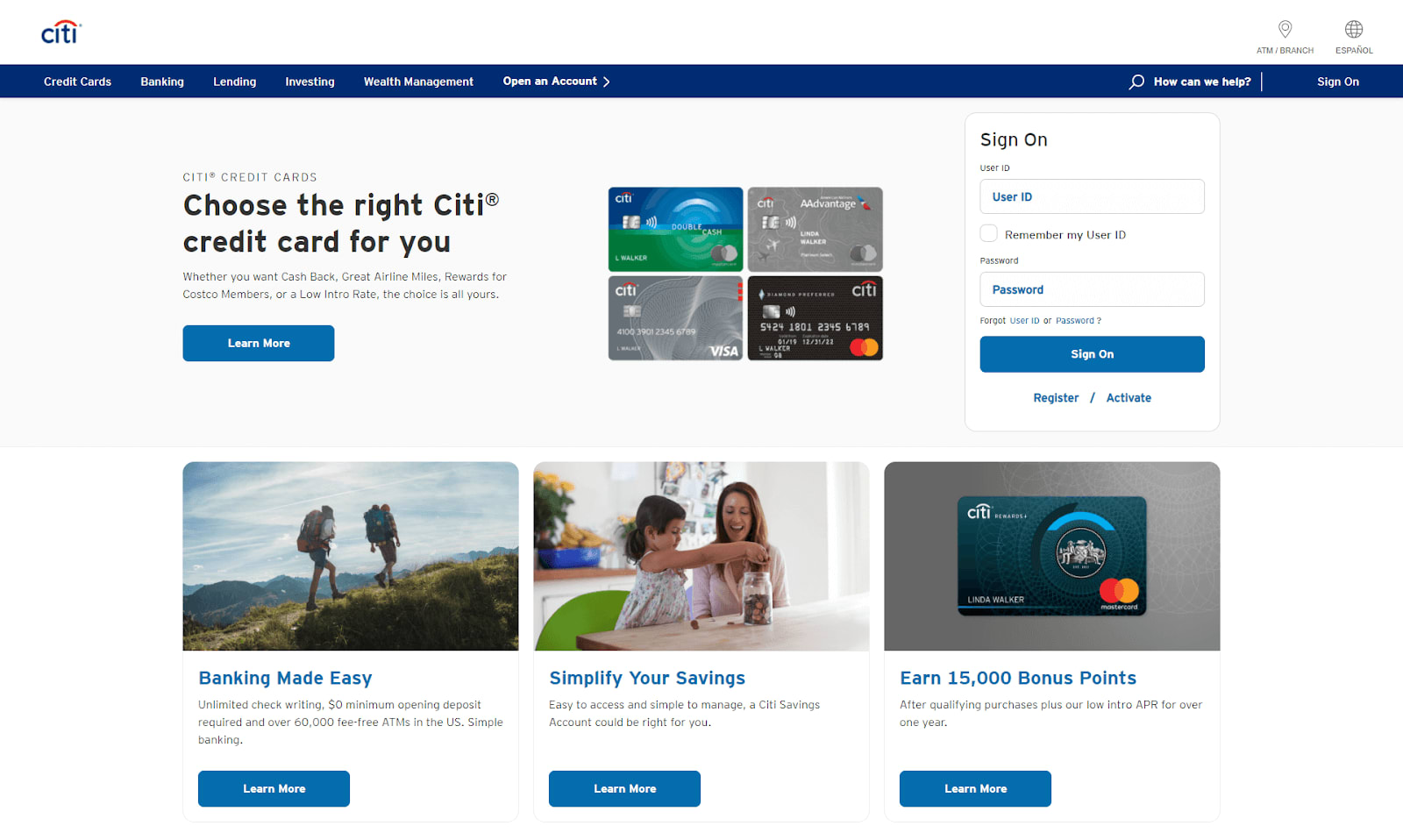
The well-known credit card company makes everything look pleasing to the eyes and accessible for users to get to the information they need. Minimal branding elements against dominant whitespace lays out the sections properly, making it easy for even a non-techie person to click and browse over.
Being straightforward is a necessity for a financial website. While some use unconventional layouts, they also manage the design to make it easy for the website visitor to browse and use. As with any sector, an interface that is easy to navigate is more convenient for a user to scan over the website.
Separate sections by having generous use of whitespace for a neat layout. This financial website design element will help the user scroll over your content to look for the menu or navigation link that contains the content they want to read.
2. Proper Pairing of Text and Images
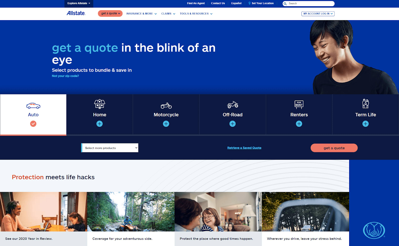
For this insurance company, they use images that correlate directly to the headings in the below-the-fold sections. They prefer to use images and texts that align clearly with each other and avoid the fuss of subtle or complex branding visuals.
Match images with relevant text to communicate your financial services effectively. Placing text overlays or any preferred placement enhances the context of the photos that you use. Place this pairing in specific subpages to relay or emphasize the content if you opt for a minimalist homepage design with no images.
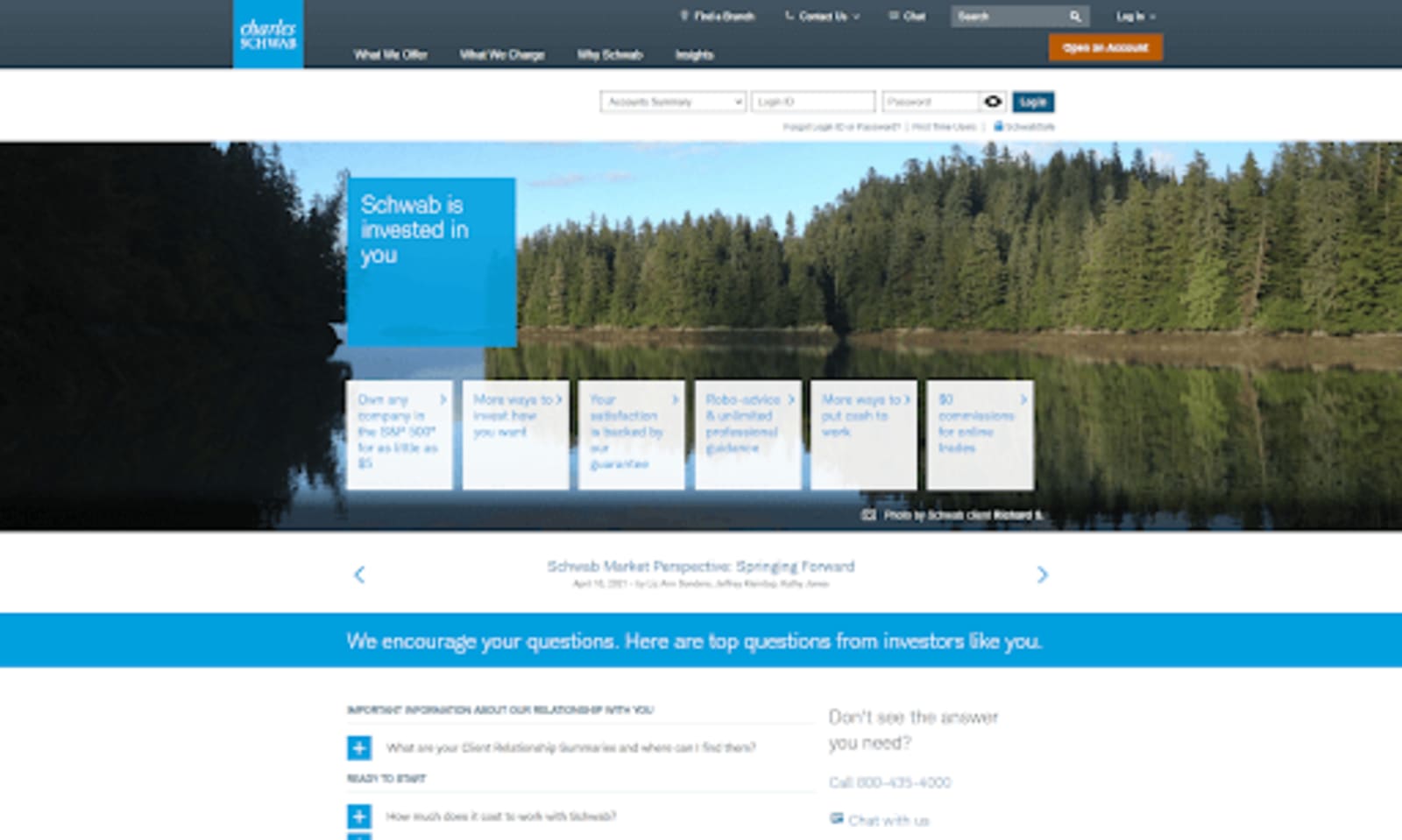
3. Home Page Carousel
The investment management firm has a responsive header carousel on its homepage that does not cover the entire above-the-fold. It is an effective method to highlight their branding and marketing messages.
A large carousel placed above the fold will contain sliders about your latest financial service promos or any marketing messages. Banks typically have this design to highlight their promotions.
For other financial services, such as loans or credit card companies, carousels are a great way to showcase their products and ongoing promotions. The advantage of placing a carousel is you can display more than one update or information within a single page. You can choose to auto-rotate them or change sliders once a user clicks the proceeding image.
4. Consistent Color Palette
With a bolder look on its homepage, the stocks and investment trading platform emphasizes its branding through a liberal splash of color. Even the menu links appear in the blue shade specific to their brand.
When it comes to branding, choose dominant colors that best represent your branding as a financial services provider. Use it generously across various areas on your website, especially in the headers or above the fold sections.
Contrast the whitespace with your signature colors and identify which areas on your website will contain the branding colors you want to include. Alternatively, other financial website designs also go for a prominent full-color look with their branding.
5. Typography Design Relevant to Branding
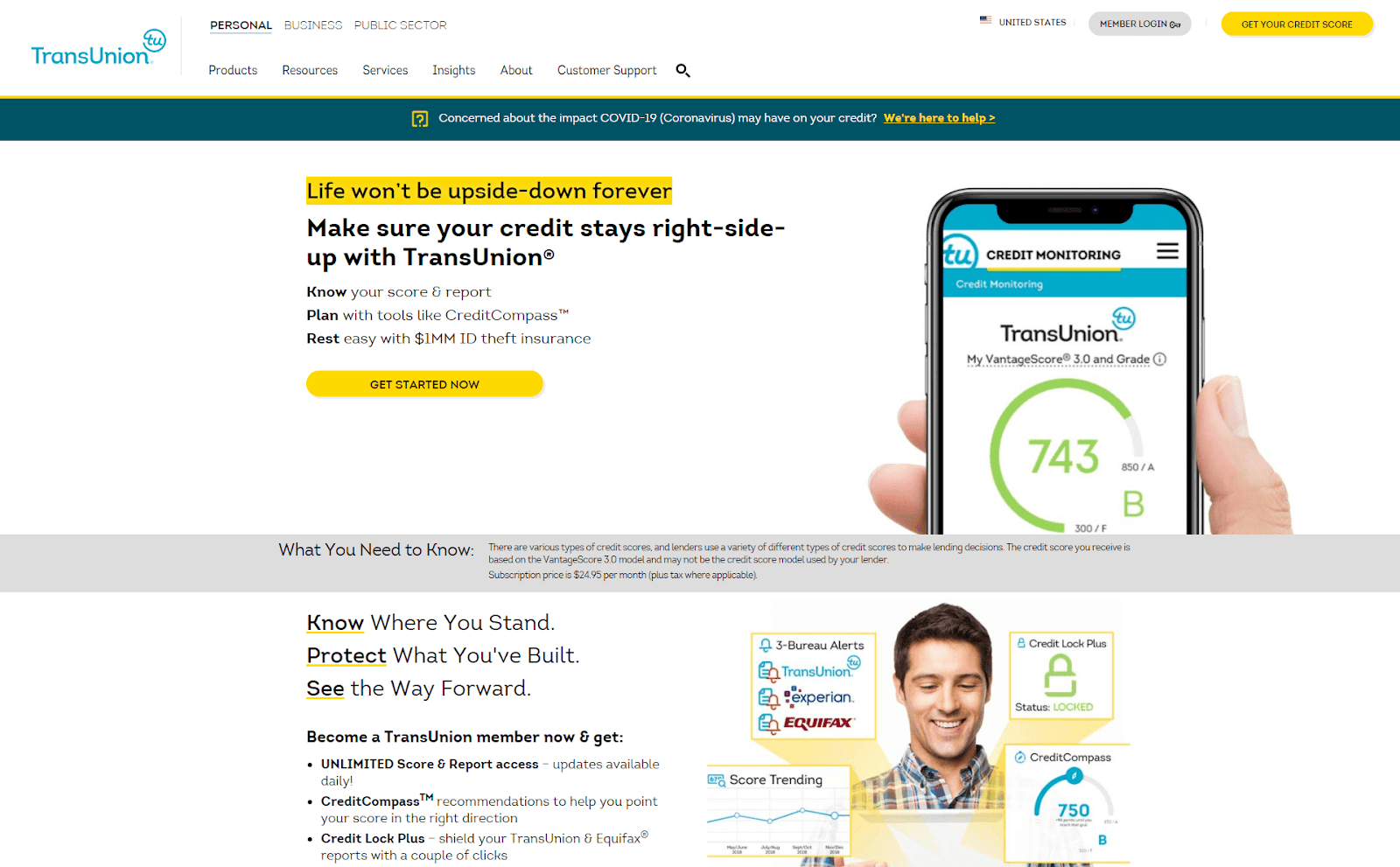
This company that provides credit report scores to its clients does not only limit the use of a specific font in their logo. On the headers and texts, they use the same or a variation of the font. As a result, the website has a consistent typography design.
Aside from the color choices, have fonts that blend well with your branding for a consistent look on the financial website. Simple and modern fonts work well for the financial sector. However, you can be creative and use other fonts that are not too loud to maintain a level of integrity.
6. Effective Use of Videos, Charts, and Graphics
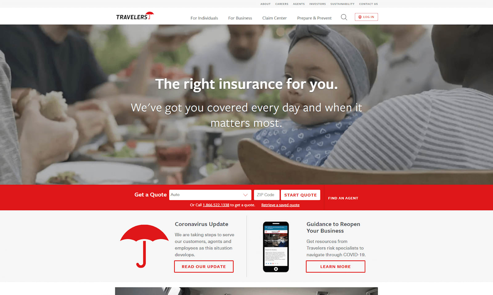
A video that plays in the above-the-fold greets the website visitors at the homepage of this insurance company. Usually, when a website has a video, the video or the entire website fails to load fast. They were able to strike a balance between providing a visual presentation while at the same time keeping the website and video optimized.
Plain texts and images may indicate a more professional financial website design. However, you can also benefit from using videos, interactive charts, and graphics that entices visitors to stay on your website and consume information.
7. Provide a Search Bar
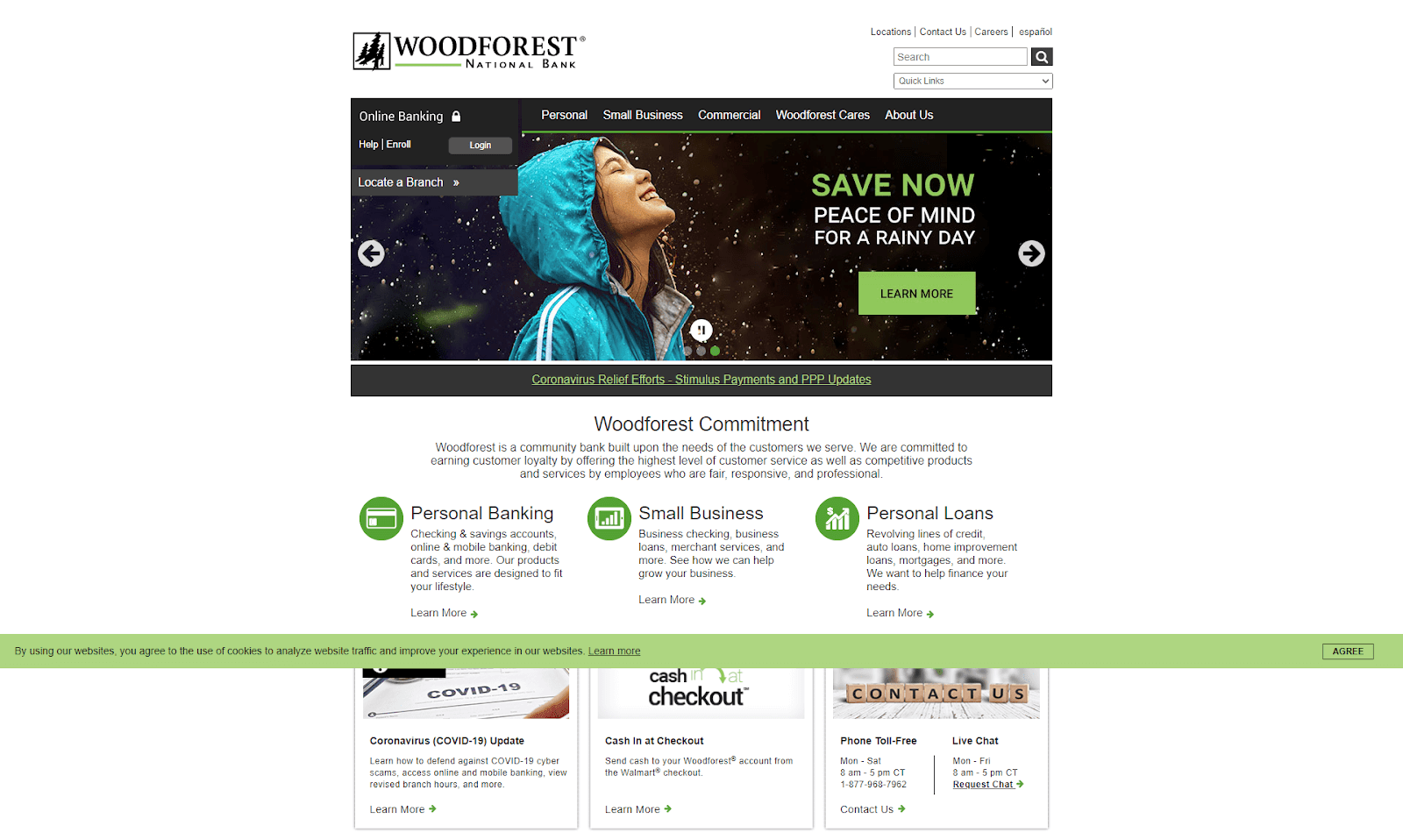
The community bank provides a search bar at the top easily noticeable and does not interfere with other design elements. Aside from the search bar, a dropdown menu to its subpages also provide quick access to various pages on the website.
Some of your website visitors may prefer to search for specific information instead of browsing across the menu. With a search function, you can lead them directly to the information they seek.
Place the search bar at the header part to make it prominent for the users. Most websites do this to assist the user with less effort in finding content on your website.
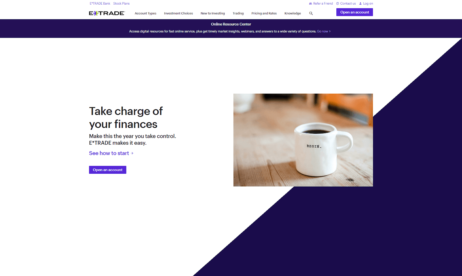
8. Visible Call-to-Action
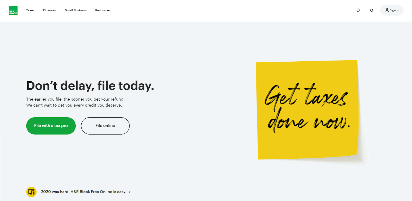
The simple, minimalist design of the tax preparation service company has bulky and visible CTA buttons spread across the sections. This design element drives the users to take action easily within the homepage.
Imply to the users that you are offering a financial service with call-to-action buttons or links that are noticeable on the homepage or other public pages of your financial website. Whether they need to fill up a form or make a call, make these buttons or links visible across the website.
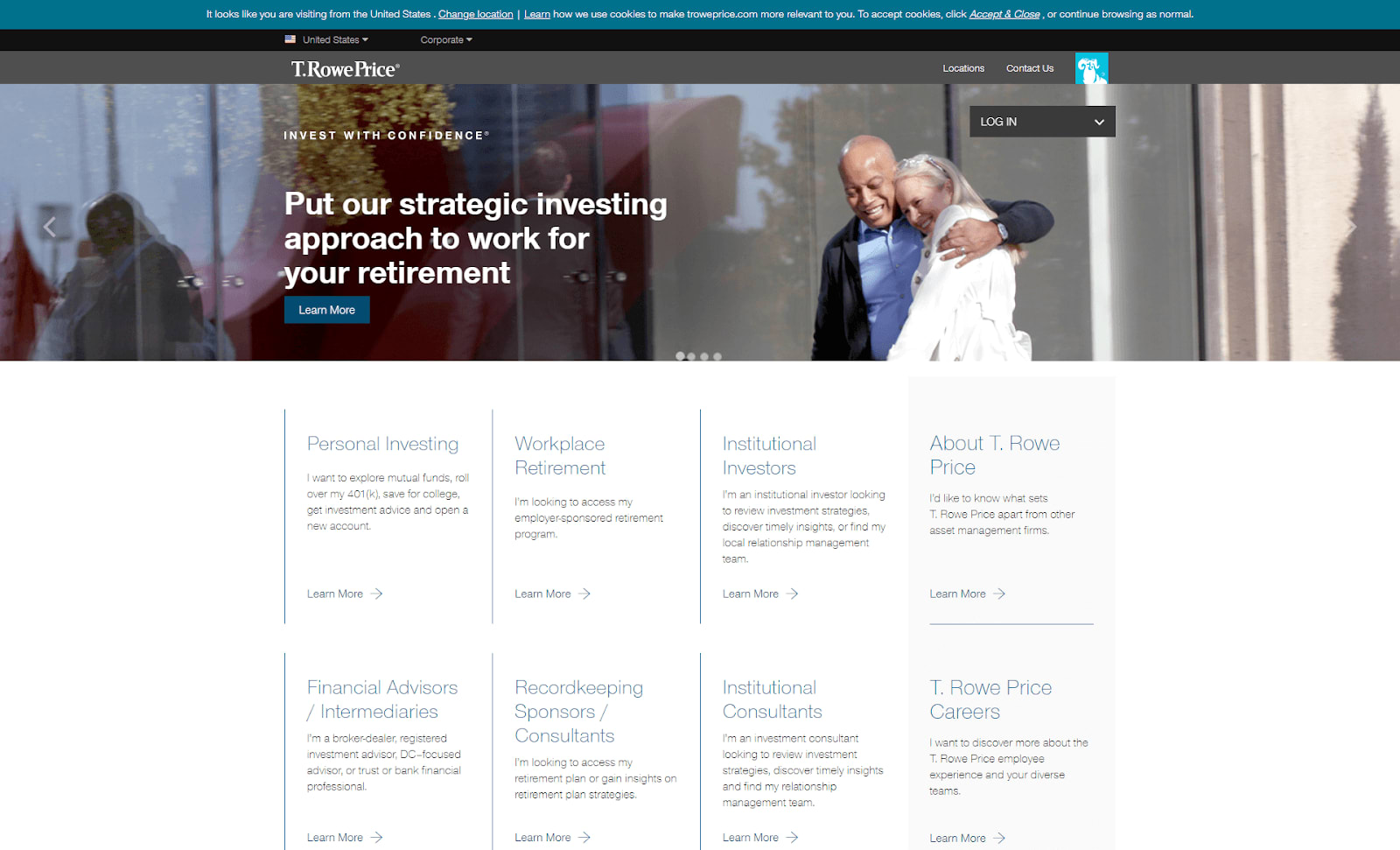
9. Navigation and Logins Are Accessible
For this investment and retirement management company, they place navigation and logins at an easily accessible placement. It dominates the top section. You can proceed right away with your intended transaction without the hassle of scrolling past the fold or deep into the page.
The menus on your financial website should be prominent and not hidden to make it easy for the users to access. The same goes for secure pages where a client needs to log in to access their data or do a transaction. Make the login links easily accessible to prevent users from getting frustrated on doing business with you online.
Key Issues in Planning and Designing a Financial Website
One of the common issues that financial entities face when planning and designing their websites is the varying preference from decision-makers and key persons in the organization.
Have all parties involved in the design be present in all aspects of the financial website design creation, from planning to live product. Their varied inputs will make the best outcome for a financial website design that benefits the organization.
Building a Financial Services Website Design That Converts
Aside from improving the online presence, financial website design elements also serve as an essential marketing tool. It helps persuade visitors to become a client.
A financial website can generate leads through various SEO and marketing channels. However, once they land on the website, the design and elements have to capture their interest. Among the actions that a financial website has to convince the users to do can be:
- Subscribe if it is a financial information blog.
- Make a service inquiry for financial management organizations.
- Fill out forms to process inquiries.
- Make a phone call to apply for a loan and other financial services.
To get started with website design for financial services, you will need a mockup done by skilled graphic artists. There are on-demand graphic services that can help you come up with a website geared for conversion. Among them is Delesign, with its selection of proficient graphic designers who can help create a financial website design with all the elements that best fit your business.

Raffy is involved in SEO and digital marketing. He gravitates towards upcoming technologies, startups, and is an avid learner.