In recent years, tea packaging has become increasingly creative and innovative. Tea companies are now using eye-catching designs and unique materials to stand out on store shelves.
This trend is driven by the growing popularity of tea, as well as the desire of tea companies to differentiate their products. As a result, we are seeing a wide variety of tea packaging designs, from simple and elegant to playful and fun.
Important Factors to Consider When Creating Tea Packaging Designs
The Role of Color in Tea Packaging Design
Color is one of the most important design elements when it comes to tea packaging. While color can be used to convey a certain message or feeling, it can also be used to make a product stand out on the shelves.
When choosing colors for tea packaging, designers must take into account the flavor of the tea, the region it's from, and the target audience. The right combination of colors can make all the difference in whether or not someone picks up a particular box of tea.
Here are some of the most popular colors for tea packaging:
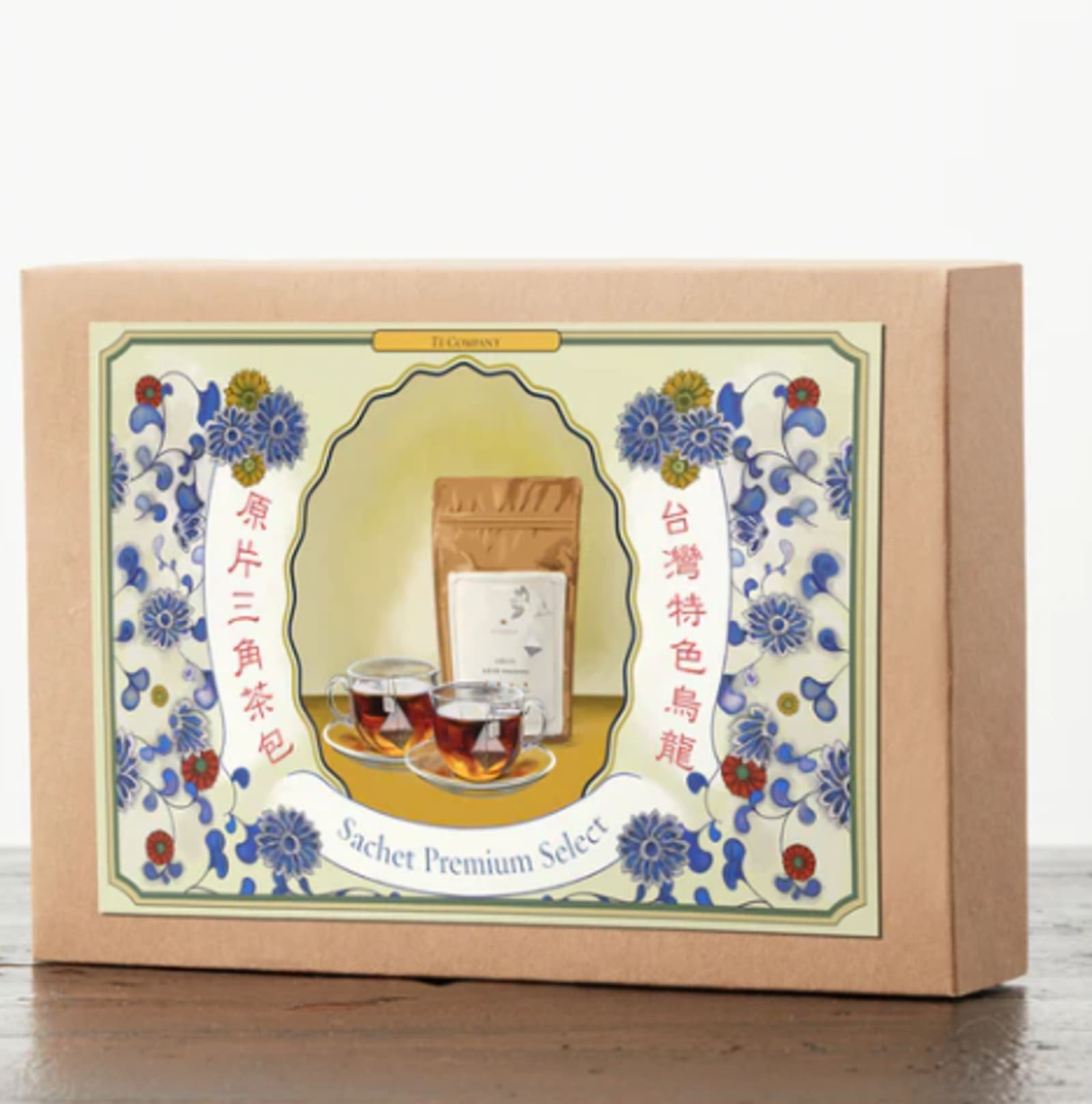
- Brown and Beige - These two colors are often used to convey a sense of luxury, so they're perfect for premium teas.
- Pale Blue - Blue is a great color for teas that are sweet in flavor.
- Green or Orange- They are often used to appeal to the health-conscious.
- Purple - This color is often used for teas with a bold taste.
- Pink - This color is often used for teas that are sweet in flavor.
- Blue and Yellow or Red and Orange - These colors are often used together to create a sense of energy, which can be appealing to some people.
- Gray - Gray is a great color for teas that are bitter, so it's perfect for black teas.

Source: The Earl Grey Tea
The Importance of Typography in Tea Packaging Design
There has been an increasing trend of tea companies paying close attention to the typography on their packaging. This is because typography can play a big role in the overall design of a tea package and can help make a tea company's products stand out on store shelves.
Good typography can convey a lot of information about a product to potential customers and can help create an overall impression of quality. For these reasons, it is important for tea companies to carefully consider the typography of their packaging when designing new products.
Some of the most common typography mistakes that tea companies make are:
- Using too much contrast between the type and the background color.
- Using too many colors in a design.
- Not adding enough contrast between the type and the background color.
- Using an all-caps font for the main text of a product's packaging.
- Using too much negative space.
- Using a too large font size for the main text of a product's packaging.
- Not using typefaces that are easily readable at small sizes on paper.
- Using a serif font for the main text of a product's packaging.
Good typography should use a variety of different fonts and sizes to create a balanced design. A great example of this is the packaging for the tea brand, Harney & Sons.

Source: Harney & Sons
Images and Illustrations in Tea Packaging Design
In the world of tea, packaging design is everything. The right images and illustrations can make all the difference in whether or not a potential customer buys your product.
Tea is an ancient beverage, with a rich history and culture behind it. The tea packaging design should reflect this rich history and culture, while also appealing to modern sensibilities.
The right images and illustrations can make all the difference in whether or not a potential customer buys your product. When designing your tea packaging, consider using traditional imagery that reflects the history and culture of tea, while also incorporating modern design elements to appeal to today's consumers.
For instance, the illustrated tea packaging designs below are cleverly designed to appeal to both modern and traditional sensibilities.
Source: The Tea Company of New York
The illustrations on these tea bags by The Tea Company of New York combine a variety of elements, including hand-drawn illustrations and retro typography.
Using Negative Space in Tea Packaging Design
An increasing number of tea companies have been incorporating negative space into their packaging design. Negative space is the area around and between the main subject of an image. When used correctly, it can add visual interest and balance to a design.
Negative space can be used in a variety of ways in tea packaging design. For example, it can be used to create a sense of movement or to highlight a particular element of the design. It can also be used to create a feeling of tranquility or serenity.
When used correctly, negative space can make a big impact on the overall look and feel of a tea package. It can help to set the tone for the product and make it more visually appealing. As such, it is an important tool for tea companies to consider when designing their packaging.
A great example is the packaging for Imperial Tea Exports (IMPRA). In their tea bags, they have incorporated a unique pattern that is made up of negative space. The design looks amazing and is sure to draw attention in the store.

Source: Needl
Finishing Touches for Tea Packaging Designs
When it comes to tea packaging, there are many things to consider. The design must be eye-catching and appealing, but it also must be functional. Here are some tips for creating the perfect tea packaging design.
Consider the material of the packaging. Tea packaging can be made from paper, plastic, or metal. Each material has its own benefits and drawbacks. For example, paper is generally more eco-friendly than plastic, but it is not as durable.
Think about the shape of the packaging. Tea bags are typically rectangular or square, while loose leaf tea is often packaged in round tins. The shape of the packaging should be determined by the type of tea it will contain.
Choose colors and patterns that will make your tea packaging stand out on store shelves. For example, tea bags can be printed with colorful designs or patterned with stripes and dots. While tea tins are not normally printed, they can be coated in metallic foil or highlighted with a reflective coating.
Final Thoughts
Tea packaging design is an important aspect of the tea industry. There are many factors to consider when designing tea packagings, such as the type of tea, the target audience, and the overall aesthetic of the packaging. By keeping these factors in mind, you can create eye-catching tea packaging designs that will stand out on the shelves.

Krisana is a journalist turned SEO Content Writer with keen interest in tech, software, and innovations. She is an avid fan of Elon Musk and wants to be part of the future Human Mars Mission. In the meantime, she spends her time researching and writing about everything that could make life a better place on Earth. Outside of work, Krisana dedicates her time with her two lovely kids.