Your website loads. Your logo is fine. Your social posts go out on schedule. And yet somehow, next to your competitors, your business still looks smaller, newer, less established than it actually is. If that sounds familiar, the problem probably isn't your product or your team. It's your design, and the good news is that it's fixable with affordable graphic design services built for exactly this problem.
Most business owners assume design is a nice-to-have, something you get around to once the "real" work is done. But design is often the first and only impression a potential client gets before they decide whether to trust you. Get it right, and you look like the established, capable company you are. Get it wrong, and you look smaller than you actually are, no matter how good the work behind the scenes might be. Reach out to Delesign to see how a dedicated design team can close that gap.
Why First Impressions in Design Are Harder to Recover From Than You Think
People form an opinion about a business within seconds of seeing it, often before they've read a single word. A cluttered homepage, a stretched logo, or mismatched colours between your website and your Instagram page all send the same signal: this business isn't quite put together yet. Once that impression forms, it's hard to undo. A visitor who assumes you're a smaller, less credible operation isn't likely to stick around long enough to learn otherwise.
This is especially costly for growing companies. You might have the systems, the team, and the client results of a much larger operation, but none of that comes through if your design doesn't say so. Prospects only have what they can see to go on. Professional graphic design isn't about vanity. It's about making sure the first impression matches the reality of what you've built.
The DIY Design Trap and What It's Actually Costing You
Plenty of business owners start out designing their own materials, and there's nothing wrong with that in the earliest stages. The trouble is that many companies never move past it. They keep patching together logos, slide decks, and social graphics using templates and guesswork long after the business has outgrown that approach.
The cost isn't always obvious because it doesn't show up as a line item. It shows up as the client who chose a competitor because their proposal looked more polished. It shows up as the ad campaign that underperformed because the creative didn't hold attention. It shows up as the hesitation a prospect feels but can't quite articulate when your materials look slightly off. DIY design has a ceiling, and once you hit it, the cost of staying there quietly outweighs the cost of getting help.
Typography, Color, and Spacing: The Details That Signal Professionalism
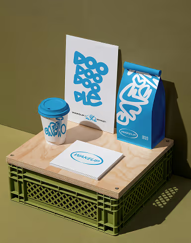
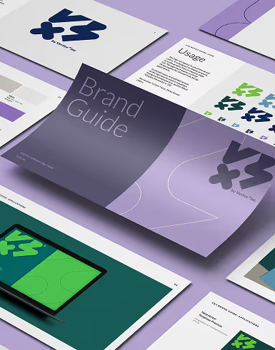
Professionalism in design rarely comes down to one big, dramatic choice. It's built from small, consistent decisions that most people won't consciously notice, but will absolutely feel. Typography that's readable and used consistently across every touchpoint. A color palette that stays the same whether someone is looking at your website, your email signature, or your latest social post. Spacing that gives content room to breathe instead of cramming everything into a page.
These details matter because inconsistency reads as carelessness, even when the underlying business is anything but careless. A team that has invested in flat rate graphic design services tends to have this consistency baked in from the start, simply because the same design standards get applied to every asset, every time. That kind of polish is hard to fake with a patchwork of freelancers or one-off projects, but it comes naturally when one team is handling everything.
How Inconsistent Design Across Platforms Shrinks Your Perceived Size
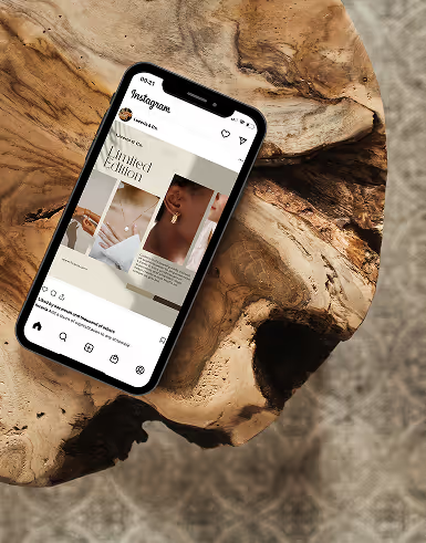
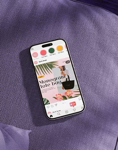
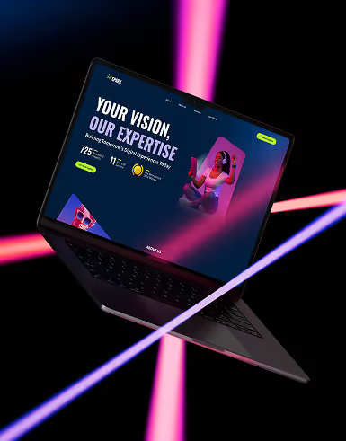
Think about how many places a prospective client might encounter your brand before they ever speak to you. Your website, your LinkedIn page, a PDF proposal, a trade show banner, an email newsletter. If each of those looks like it came from a different company, that inconsistency tells a story, and it's not the story you want told.
Larger, more established businesses tend to look the same everywhere. Their fonts match. Their colours match. Their tone matches. That consistency is part of what makes them feel bigger and more trustworthy, even when the actual company behind the scenes is leaner than people assume. Fixing this doesn't require a total rebrand. It usually just requires one team overseeing all your design, so nothing slips through looking like it belongs to someone else.
Leveling Up Your Visual Presence With Affordable Graphic Design Services
The good news is that closing this gap doesn't require a massive budget or an in-house creative department. A graphic design subscription service gives growing businesses access to a dedicated designer who handles everything from social graphics to sales decks to web assets, all under one roof and one flat monthly rate. Instead of piecing together freelancers for each new project, you get one team that knows your brand and keeps it consistent everywhere it shows up.
Unlimited graphic design services also mean you're never stuck choosing between polish and budget. Need a new pitch deck this week and a batch of social templates next week? It's all covered under the same subscription, with no surprise invoices and no scrambling to find someone new every time a request comes in.
Your business has already put in the work to grow. Your design should reflect that, not undercut it. Connect with the team at Delesign to find out how a dedicated designer can help your business finally look as established as it really is.

Our designers work with you as part of your team to ensure quality results.