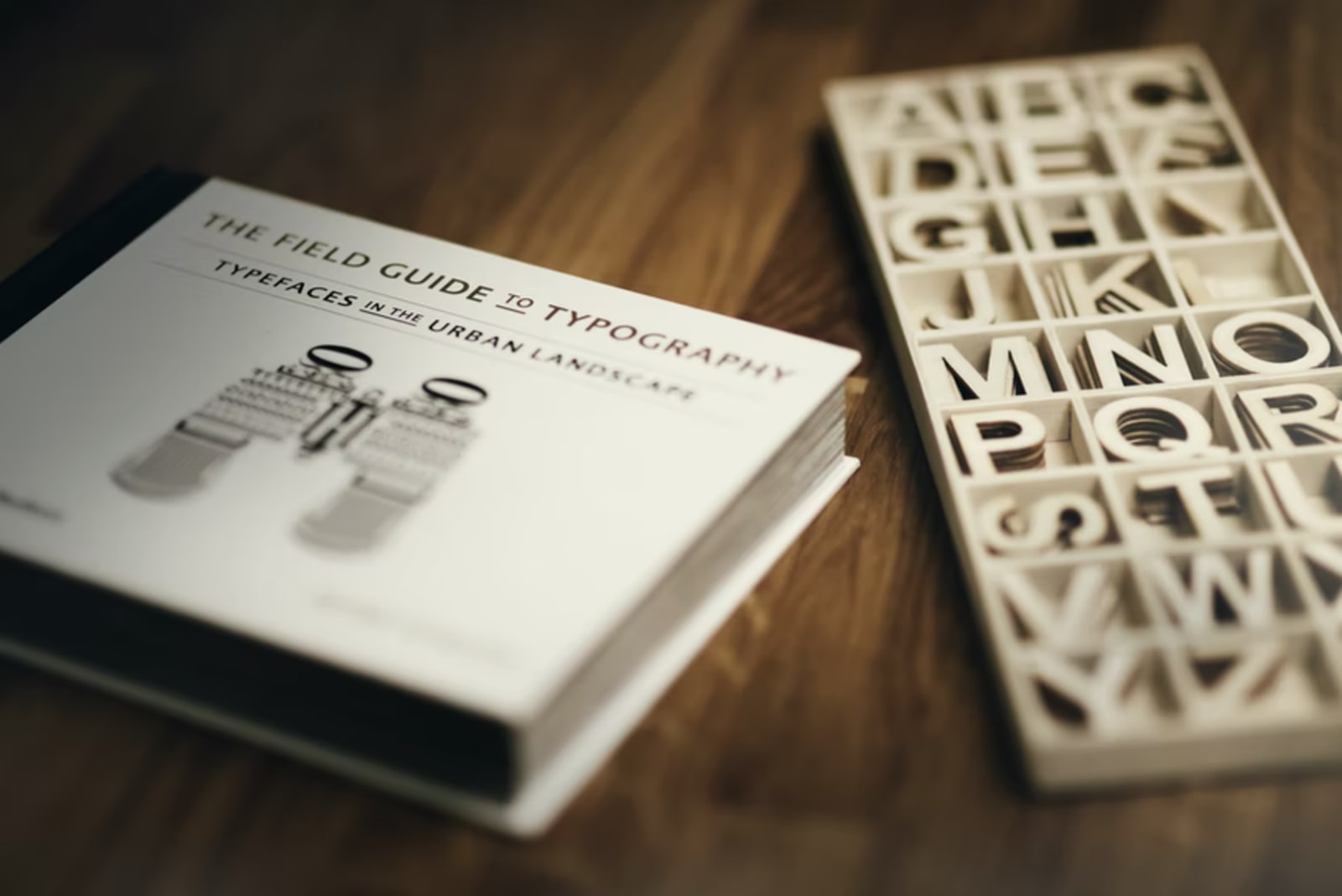
The brand image of a business relies heavily on the words it uses and how you present them. That's why you have to choose the right typeface for your business. It becomes the basis of how your business appears to potential customers.
A Consumer WebWatch survey polled 1,500 U.S. adults and found out that 46.1% or half of the consumers judge the credibility of a business based on visual design. The typography and font size were among the design elements that mattered to them.
Thus, you need to consider the typography of your business by knowing the terms used in the industry. One of which is that typeface and font have different meanings. Let's get to know them.
Difference Between Typeface and Font
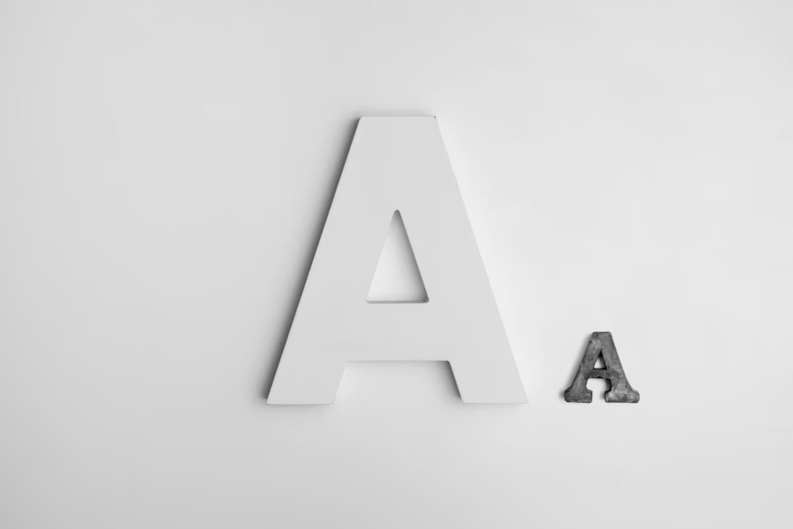
It's easy to interchange typeface as the font you'll be using for your business. However, don't get confused. Both are different terms used to indicate typography.
Typeface relates to the family of the font in which a single font belongs. The term font, on the other hand, identifies the specific design of the letters.
The most used font Arial, for instance, has a Serif typeface. Another font, the Times New Roman, has a Sans-Serif typeface. Designers use the term typeface to indicate the base styling of the letters, while the widely known term font is for the exact letter design.
Businesses that are yet to design their graphics and typography have to start by identifying a typeface. The typeface will then become the foundation for its typography and overall graphic design. You will have to choose between two typefaces: the Serif and Sans-Serif, which we'll explore more here.
Which Typeface Is Best for Business?
There are two main typefaces you can choose for your business - the Serif and the Sans-Serif format. Before you pick a typeface, let's refer to a joint study by Google and IBM. The eye-tracking study showed the following results when it comes to reading comprehension:
- Serif is easier to read with its contrasting thin and thick lines.
- Sans-Serif, with fewer distractions on the text, is faster to read.
As you can see, both don't have a large gap when it comes to reading comprehension. However, they differ in how businesses use each typeface. Here is what makes them different:
Serif

The Serif typeface has additional strokes at the base or edges of the letters. This particular font family has a detailed look, accentuating the overall form of each letter.
Some of the worthy examples of a Serif logo include Volvo, Zara, and Rolex. The New York Times logo is also a notable example - they have been using a Serif typeface for about 150 years already. What you can commonly see across their logos are the decorative strokes. This design element rests along the edges of the letters.
While you may consider the Serif typeface as outdated, it still works for any industry. Modifying a Serif typeface allows you to use it even for luxurious or modern branding. It's about careful execution, from the specific font to the letter spacing.
Go for a Serif typeface if you want to indicate to your audience that you're an established and trusted business. The Serif typeface started gaining popularity among businesses centuries ago. It is only in recent times when brands went for straightforward typography, the Sans-Serif as its counterpart.
Sans-Serif
The other option is the Sans-Serif typeface. It has a more simplistic, minimalist letter construction with no accents, which its counterpart has.
Businesses typically switch to a Sans-Serif typeface when rebranding. They do it to imply that their company is moving towards innovation - in which a minimalist typeface can present accordingly.
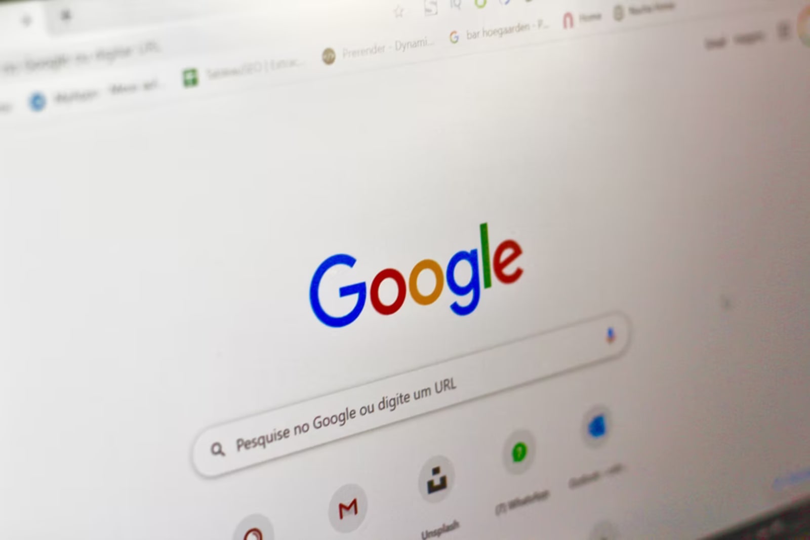
The majority of tech companies choose this typeface as it exudes modernity. Well-known tech companies that went for a Sans-Serif include Google, Microsoft, Spotify, and many others. However, it also applies to other industries, such as the logos of Jeep, Canon, and The Guardian. These companies opt for a Sans-Serif as it looks clean.
If you want clean typography, the Sans-Serif would be an excellent option. It's an appealing typeface for businesses that want decluttered typography. The modern strokes without decorative patterns provide a tidier presentation of your business.
How Do I Choose a Typeface for My Business?
Before picking randomly between the two font families, it's important to know what to consider first. A few factors that you need to include when deciding are the following.
Speaks to your target audience
Your target audience will be viewing your logos and all other materials with your chosen typeface. Thus, you have to identify what your target demographics like to see.
The Serif typeface can work for various demographics - from the Boomer generation to the Gen-Z population. You can modify a Serif typeface to make it look appealing to the majority of your target audience. Coca-Cola, for instance, does not have a specific audience and has a broader market, so they chose Serif typeface as its more general typography. An example of modifying Serif typeface is the fashion brand Zara where the design looks modern and relevant despite its heavy strokes in the edges.
Sans-Serif, on the other hand, may well be suited as a no-nonsense approach to branding. The technology firms using a Sans-Serif typeface prefer to keep it simple. It speaks to a target market with more modern tastes.
Aligned with your brand
The careful choice of typeface affects your brand perception. Thus, be critical in the selection of typeface depending on your brand image.
More established firms already have an existing Serif typeface, and some of them prefer not to change them. It indicates their longevity in the industry. Meanwhile, modern and innovative businesses prefer the Sans-Serif typeface. It will be up to you to style a Serif typeface to achieve a sleek design. What matters most is that the typeface will reflect your branding.
Both Serif and Sans-Serif typefaces can act as baselines for the branding of your business. See to it that you use and modify them accordingly, ideally with a suitable choice of font.
Easy to read
As much as you want to infuse creativity, it's best to stick with an easy-to-read design. Make sure that people can easily recognize your brand. Even if you modify the typeface, make it so that it appears easy in the viewer's eyes.
A Serif typeface does not necessarily mean it's hard to read due to the accents on its edges. Also, the minimalist Sans-Serif is not automatically easier to read as there is no distinction between letters. Both typefaces can work well for any business. It just depends on how well you design the typeface as a base for your typography.
In Closing
Have a complete and holistic view of your brand perception when choosing which typeface for your business. Whether it's Serif or Sans-Serif, what's important is that the typeface aligns with your brand presentation, relates to your audience, and is easily recognizable.
Graphic design doesn't have to be complex when picking a typeface. Designers can recommend which to use and consequently create the font styling to use for your business creatives. There are several options nowadays to have a designer - a freelancer, agency, or design subscriptions.
Subscribing to on-demand graphic design services like Delesign provides you with enough flexibility and design capability. The availability of design expertise from Delesign is easily accessible, giving you unlimited graphic design output and revisions. From choosing a typeface for your business to entire creatives, the designer from Delesign will work with you in crafting a concrete brand identity.

Raffy is involved in SEO and digital marketing. He gravitates towards upcoming technologies, startups, and is an avid learner.