Most clients can tell when a design feels off, but far fewer can say why. Professional work solves a specific communication problem, follows a consistent brand system, and arrives in files that are ready to use wherever they're needed. It's judged on function and consistency, not on whether it looks attractive at first glance. If you buy graphic design services regularly, whether through an agency, a freelancer, or a dedicated graphic designer on a subscription, knowing what to look for protects both your brand and your budget. The signs are easier to spot than most people expect, and most of them show up in the type, the spacing, and the files. If you'd rather skip the guesswork and work with a team that builds to these standards, get started with Delesign today.
Why "looks nice" isn't the same as "professional"
A design can look attractive and still fail the job it was hired to do. Professional work starts with a purpose: who the piece is for, what it should make them do, and where it will appear. A polished social graphic that buries the offer, or a flyer that ignores the brand's established look, is decorative but not professional.
Clients often judge on taste because taste is the easiest thing to react to. Taste is subjective, though, and it shifts from person to person on your team. A better test is whether the design communicates the right message quickly to the right audience and fits the rest of your brand materials. When a design passes that test, personal preference becomes a smaller part of the conversation, and feedback gets much easier to give.
Typography and brand alignment: the details untrained eyes miss
Typography is where trained designers show their skill. Professionals choose typefaces that suit the brand's personality, limit how many they use, and build a clear hierarchy so the eye knows where to go first, second, and third. They pay close attention to line spacing, letter spacing, line length, and alignment, because small errors in those areas make text tiring to read even when no one can name the problem.
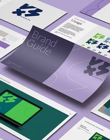
Brand alignment goes hand in hand with type. A professional works from your logo rules, color palette, and font choices and applies them the same way across every asset. This is one reason many businesses prefer a dedicated graphic designer over a rotating pool of freelancers. A designer who works on your account every day learns your standards and doesn't need them re-explained with each request. Over time, your materials start to look like they came from one team, which builds recognition with customers.
File organization and print readiness: the invisible half of the job
Much of a designer's value sits in the files you receive, not in the image on screen. A professional delivers organized, clearly labeled source files with named layers, linked or embedded fonts and images, and a consistent folder structure. That organization means anyone can open a file months later and make an edit without rebuilding it.
Print readiness matters just as much. Professional files use the right color mode, typically CMYK for print and RGB for screens, and are built at the correct resolution with bleed and safe margins where needed. Logos arrive as vector files so they scale without losing sharpness. Ask for a package that includes editable source files, print-ready PDFs, and web-ready exports. If a designer can only send you a flattened JPEG, you'll pay for that gap the first time you need a banner resized or a brochure printed.
What amateur work gives away, even when the colors are right
Correct brand colors can hide a lot of problems. Watch for the common signs of inexperienced work: uneven spacing between elements, text that sits too close to the edge of the page, too many fonts or effects, low-resolution images that look soft when enlarged, and stock photos that don't match the brand's style. Another is crowding, where every element competes for attention because nothing was prioritized.
Professionals leave room to breathe. White space is a deliberate choice, and it directs attention to the message that matters most. Amateur work tends to fill every gap, while professional work knows what to leave out. If your deliverables feel busy or slightly off in ways you can't pin down, one of these issues is usually the cause.
How a professional designer actually handles feedback
A professional designer treats feedback as part of the process, not a threat to it. They ask clarifying questions, explain the reasoning behind their choices, and separate subjective preferences from objective problems. If a requested change would weaken readability or break brand consistency, they say so and offer an alternative.
You can help by describing the problem rather than prescribing the fix. "The headline gets lost on mobile" gives a designer something to solve, while "make it bigger" may not. Good designers also revise quickly and without defensiveness. Unlimited graphic design plans make this easier because revisions don't carry a per-round fee, so you can refine the work until it's right without watching a meter run.
Why credentials and software don't guarantee quality on their own
A degree, a portfolio of well-known clients, and mastery of industry software are all positive signs, but none of them guarantees quality on its own. Software is a tool, and owning it doesn't produce good judgment. Credentials show training, not how someone performs against your deadlines and your brand.
Look at evidence of consistent output instead. Review work that resembles what you need, check whether the style adapts to different brands, and test responsiveness with a small first project. Reliability counts too. A talented designer who misses deadlines costs you more than a solid one who delivers on schedule. Services built around flat rate graphic design, with set turnaround times and a money-back guarantee, let you test quality without committing to a long contract.
A quick rubric to judge your own design deliverables
Use these questions to score any deliverable. Answer yes or no to each, and treat several "no" answers as a reason to raise the issue with your designer.
- Does the design communicate its main message within a few seconds?
- Does it follow your logo, color, and font rules exactly?
- Is the type hierarchy clear and easy to read at the size it will be used?
- Is the spacing consistent, with room around key elements?
- Are the images sharp and consistent in style?
- Did you receive editable source files and print-ready or web-ready exports?
- Does it look like it belongs with the rest of your materials?
If most answers are yes, you're working with a professional. If you're still comparing options, monthly graphic design packages from a provider like Delesign give you a consistent designer and predictable costs, and current plans are listed on our pricing page. Get in touch with the team to see how it would work for your business.

Our designers work with you as part of your team to ensure quality results.